Together, We’ll Make History

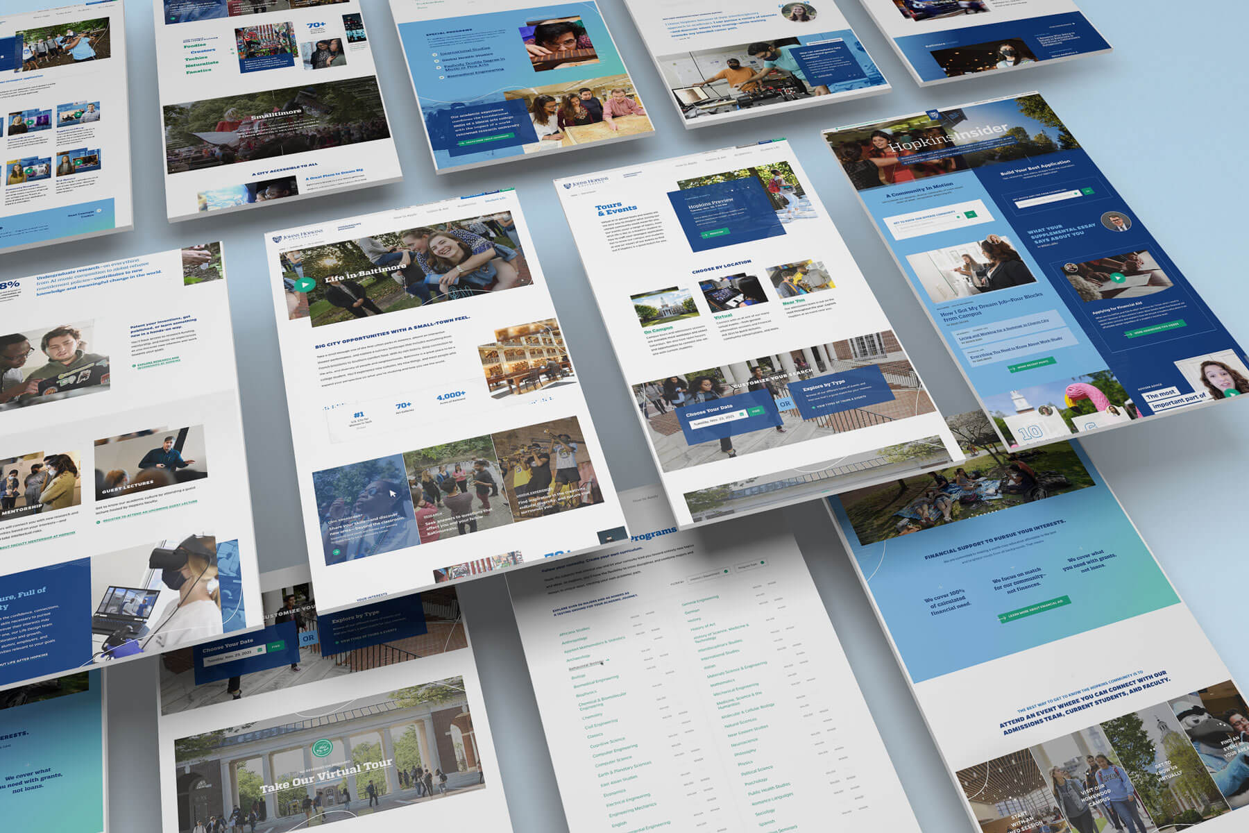
In conjunction with a undergrad admissions brand update, the Apply portion of jhu.edu needed a total overhaul. An extensive strategy review set the foundation for sitemap, wireframes and overall UX process for each section of the site … application, financial aid, Hopkins Insider (the student and counselor blog), and tours & events. Though most recognized for their scientific achievements, the design needed to represent the diversity, energy, and legacy of all aspects of the university. Fluid lines that weave and flow from section to section … a structured horizontal line pattern nods to music and the humanities … a persistent gradient that moves users throughout the page all speak to a living university

made @ mission

View Site

Streamline the process of finding and signing up for tours & events. Integrated with the Slate platform, students are seamlessly added to the Admissions funnel for continued communication throughout their college search

Hopkins Insider

HI is the Hopkins student and admissions counselor blog. A fully custom approach was created where the content was bucketed together so users knew what perspective the info was coming from. Each side scrolls independently of the other to encourage people to jump around and explore more that just ‘most recent’ or ‘featured’ content.

View Site

Student Financial Services

The Financial Aid microsite was also updated for current students. Student Financial Services focused on simplifying, clarifying and aiding in make college affordable for all students

View Site