Nike Hockey Club Launch Concept
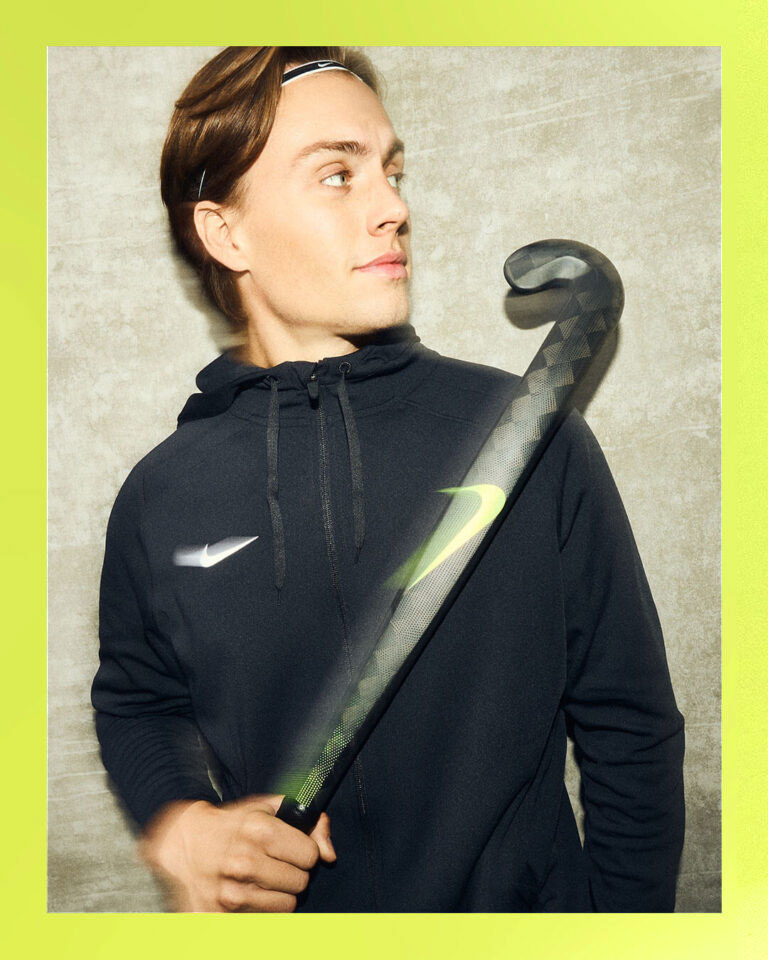
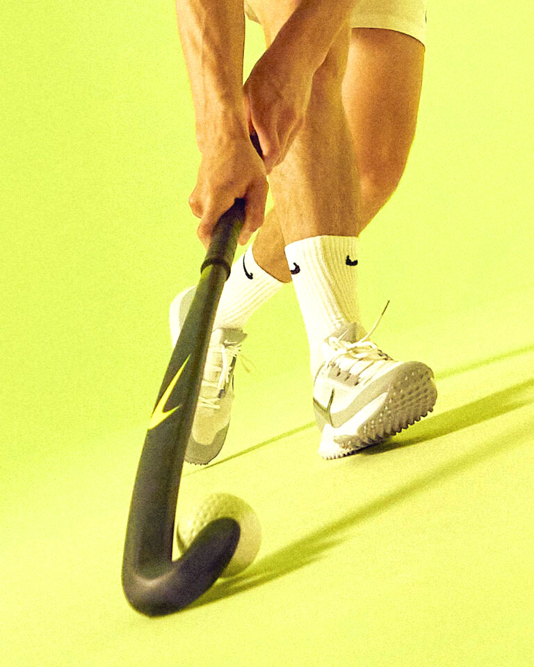
You know when things just work out—like they’re meant to be? It’s such a satisfying feeling. So imagine our excitement when we looked at the hockey stick, looked at the swoosh, looked at the hockey stick, and smiled. Turns out Nike is the key to hockey. It’s like they were separated at birth. Like they were finishing each other’s sentences. Like there was some sort of magnetic pull that snapped them into place and the world got fuller. Great apart. Better together.
GOOD MATCH.
To launch their new line of elite field hockey (just hockey in the EU) sticks in Europe, and enter the market for the first time, this campaign concept was created to elevate both product and player. Pairing imagery with the swoosh’s natural stick shape, the logo is a literal extension of the athlete. Bold, clean, and unexpected … all the hallmarks of a memorable Nike campaign.
made at mission


