Running With the Greyhounds

Loyola University Maryland came to us at an inflection point. The 200-year-old Jesuit institution had it all—a loyal community, a beautiful campus, a transformative student experience, and respected academics—but its brand wasn’t telling the full story. Our challenge wasn’t to build something from scratch. It was to isolate what Loyola really is and then amplify it for the world to hear.

made @ mission
Creative Director: Todd Harvey, Strategy: Ashleigh Long, Photo, Video & Production: Alex Brune, Copywriting: Matt Reinertson
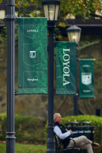
Loyola Maryland brand banners displayed along a campus walkway

We began by getting to know everything about the school. In partnership with Edge Research, we conducted focus groups with prospective students and alumni, coordinated listening sessions with current students, and sat in on countless group discussions with faculty and staff from across the university. All of that research, supplemented by additional surveys, culminated in a 62-page document of strategic takeaways that shaped every decision that followed. What we heard was nearly universal: Loyola’s values, traditions, and sense of place were deeply felt by everyone who’d experienced them, but the brand wasn’t telling the full story. So we got to work with the goal of honoring the prestige and equity the university already had, while dialing up how it showed up in the world.

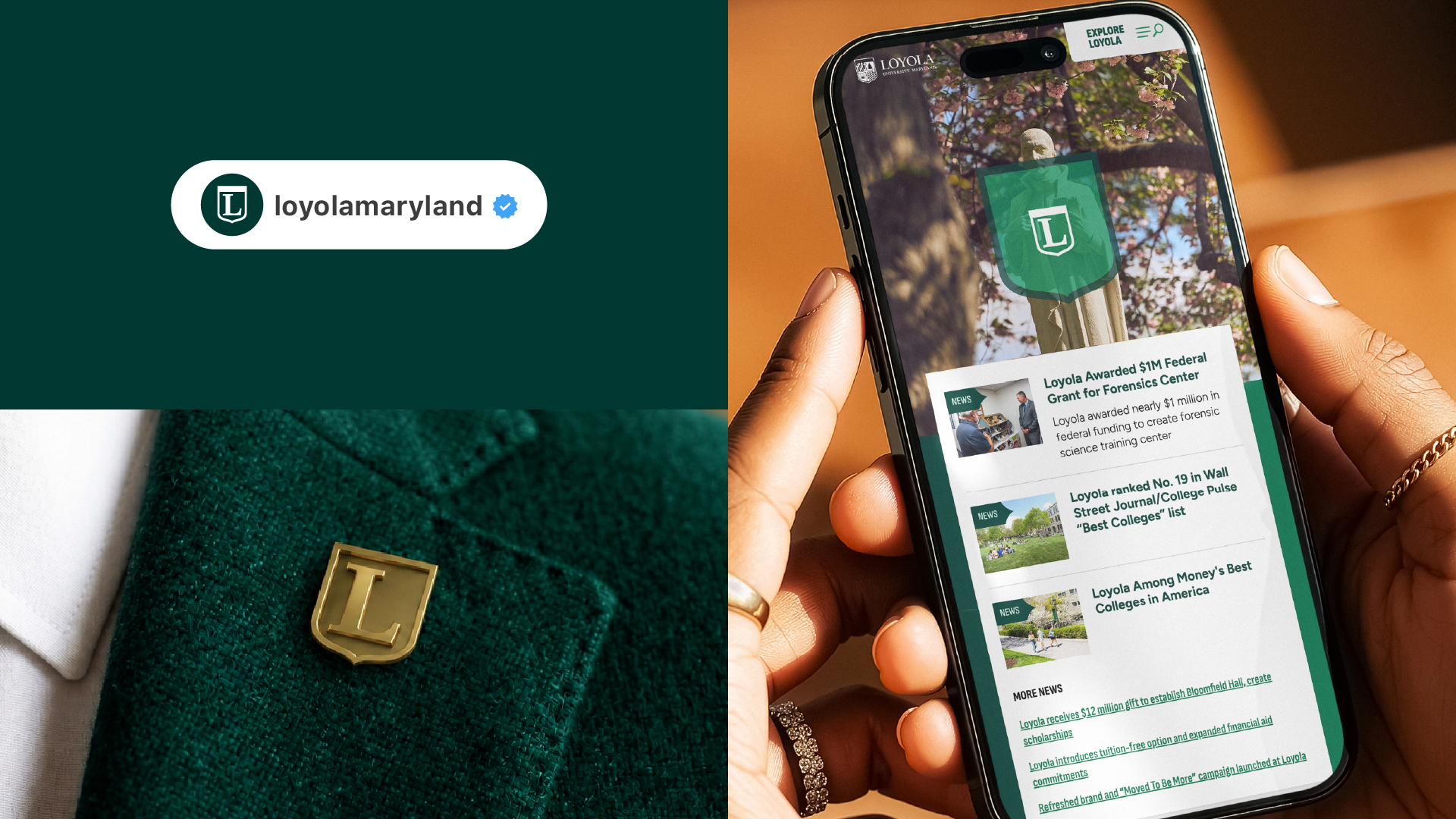
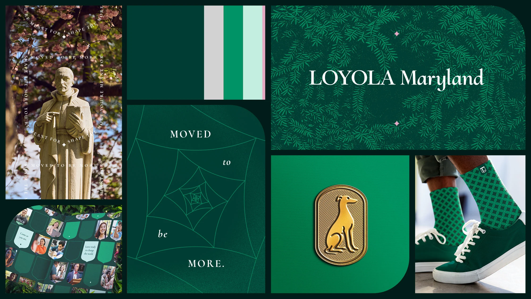
Loyola Maryland identity system with shield, patterns, typography and branded merchandise
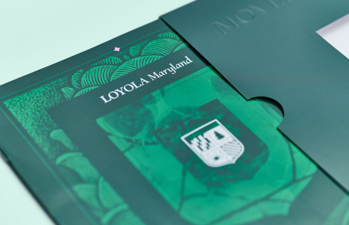
Loyola Maryland prospective student viewbook and green presentation sleeve

The prospective student viewbook was the first major expression of the new brand—an annual print piece reimagined to feel less like a brochure and more like an opening conversation. Flip through the viewbook. Learn more about the viewbook.

Going Beyond Green & Grey

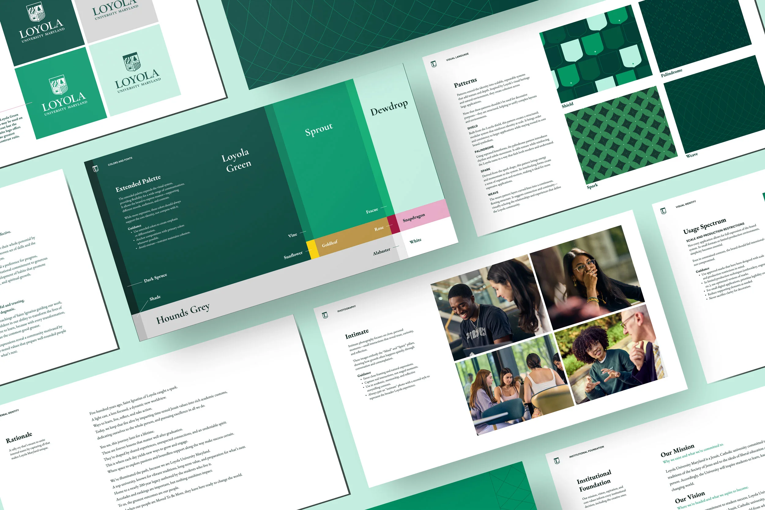
Updating the visual identity of an institution as storied as Loyola Maryland requires a careful touch. Our research revealed a deep affinity for existing imagery, so the core visual identity remains anchored in what Loyola already owned—deep greens and the iconic shield. But the system built around them was new. The shield was reimagined as an active graphic device: a container, framing tool, or pattern capable of showing up across formats without losing its weight. A spark, derived from the shield’s form, introduced energy and motion, nodding to the Ignatian idea that transformation begins with a single moment of ignition. Patterns, campus-rooted textures, and a suite of badges (the Evergreen, the Stained Glass, the Greyhound) gave the system depth. Typography does the rest: Cormorant houses heritage, Figtree keeps it modern. The visual identity is grounded in legacy and racing toward a bright future for the institution and its students.

Built around Loyola’s Moved to be More brand platform, this immersive landing page invites prospective students to discover what makes the Loyola experience unique. Through engaging visuals, thoughtful storytelling, and interactive moments, the experience encourages users to explore the university’s academics, community, and opportunities, turning curiosity into deeper engagement with the Loyola brand. Explore the Moved to be More microsite.

Loyola Maryland brand guidelines showing typography, color palette, patterns and photography
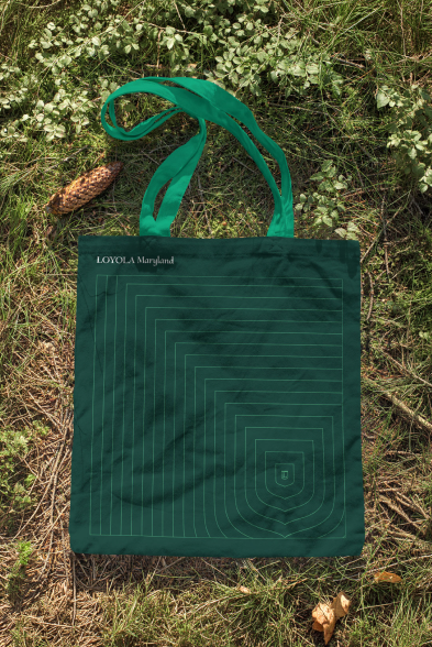
Green Loyola Maryland tote bag with geometric shield pattern
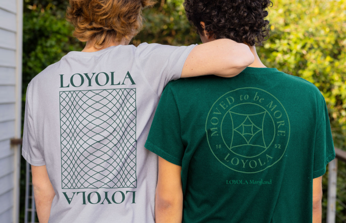
Students wearing Loyola Maryland branded shirts on campus